Eric Gill, born in 1882, described himself on his own gravestone as a “stone carver” which embraced two of his lifelong activities, sculpture and the cutting of inscriptional letters. Gill, who developed an early interest in art, began letter carving at 17. At Central School for Arts and Crafts in London he attended lettering classes by Edward Johnston, 10 years his senior, who became his mentor. In 1903 he became a self-employed craftsman and was commissioned for signs, sculptures and the carved stations of the cross for the Westminster Cathedral in London.
During his lifetime Gill set up three self-sufficient religious
communities where surrounded by his entourage, he worked as
a sculptor, wood engraver and type designer.
In 1925 Gill began working with the Monotype Corporation to
design some of their typefaces. His first was a Roman-inspired
typeface named “Perpetua,” followed by the sans-serif 1928 “Gill
Sans,” “Solus” and later “Joanna” cut by the Caslon foundry
(which he used for his book An Essay on Typography.)
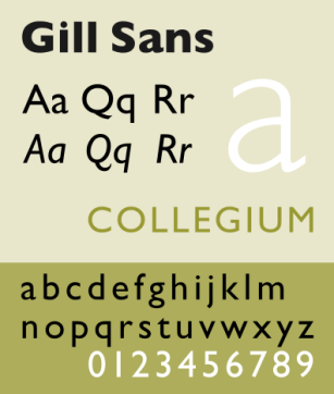
His best-known type designs were produced by the Monotype corporation, although he also designed type for private presses. His most widely used type Gill Sans, strongly influenced by the London Transport lettering of his teacher Edward Johnston, was the first successful sans type based on the humanist models of the Renaissance.
In 1916 Edward Johnston was asked to create a typeface for
the London Underground’s signage and timetables and Eric Gill
assisted in that project. When Monotype asked Gill to design
his own sans-serif for the foundry he simply revised the
existing Johnston alphabet.
The capital letters remained much the same but the lower
case letters required changes. Gill retained the two-story
lower case g, introduced his own curvaceous R and, though
controversial at the foundry, designed an uppercase J and Q
that descended below the baseline. In addition, the capital M in
Gill Sans is based on the proportions of a square with the
middle strokes meeting at the center.
Although Gill Sans has some strict geometric elements, its
classical lines and calligraphic strokes identify it as Humanist.
Eric Gill was not a fan of, what he termed, “fancy madness” in
type design. Yet he was also frustrated by the many measurement
technicalities and preferred an organic curve leading into
a serif (when there was one).
Gill and other designers were faced with the problem of their
drawn type designs being too mechanically manipulated at the
metal works when the metal dies were cut by machine workers
tracing the original sketches.
Eric Gill Quotes:
“There are now about as many different varieties of letters as there are different kinds of fools.”
“Letters are things, not pictures of things.”
“Lettering is a precise art and strictly subject to tradition. The New Art notion that you can make letters whatever shapes you like, is as foolish as the notion, if anyone has such a notion, that you can make houses any shapes you like. You can’t, unless you live all by yourself on a desert island”.
Gill sans was first released by Monotype in 1928 and became the foundry’s fifth best-selling typeface of the 20th century.
Classification; Humanist
Designer; Eric Gill
Foundry; Monotype
Date; 1928
Humanist Sans Serif: These are based on the proportions of Roman inscriptional letters. Frequently, contrast in stroke we readily apparent. Typographic experts claim that these are the most legible and most easily read of sans serif typefaces. Humanistic sans serif typefaces also closely match the design characteristics proportions of serif types, often with a strong calligraphic influence.
This slideshow requires JavaScript.
The typeface was used in 1935 by designer Edward Young on the new iconic Penguin books jacket design, putting Gill sans on bookshelves around the world.
Many other notable companies ( particulry in England ) adopted Gill sans as a corporate typeface by the mid-1900’s, including BBC, British Railways, and ultimately Monotype themselves making the typefaces Monotype’s fifth best seller of the twentieth century.
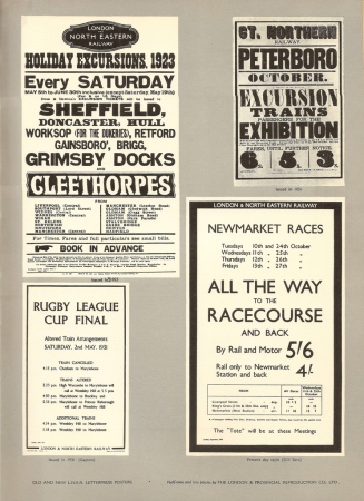
Here is an example of the typeface being used in the Letterpress Railway posters.Or in a page from the Monotype Recorder that was issued to sell the London & North Eastern Railway’s decision to standardise on the use of Gill Sans typeface. It shows a wider and fascinating range of uses.In a bold illustration of the talents of Eric Gill, with the illustration and typeface showed to effect in this page from the french design magazine “Arts and Metiers graphiques”
Also, in journals like this one! The Winter 1933 issue makes use of rulings, lettering and colour and is mostly in Gill Sans.
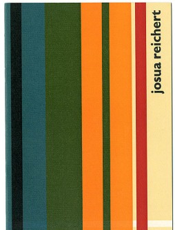
In contrast, here are also some contemporary examples of the usage of the typeface like the “Architecture & Morality by Orchestral Manoeuvres in the Dark.”Booklet called: Josua Reichert: Freilich ein Handwerker, kein, Derwisch
Georg Sorman, Gamla Stan
Gill Sans is ideal for display uses and can be used successfully as a text font at larger sizes. It’s best suited for modern designs, though it can be combined successfully with more traditional typefaces for classic designs.
Source:
Bryan, Marvin. Digital Typography
Sourcebook. New York: John Wiley &
Sons, 1997.
Carter, Sebastian. Twentieth Century Type
Designers. New York: W.W. Norton &
Company, 1995.
Info from (Myfontscom, 2016)
The final product, from the collection of Mike Ashworth
The original uploader of this poster was GearedBull at English Wikipedia
http://www.fonts.com/content/learning/fontology/level-1/type-anatomy/type-classification/.
http://desktoppub.about.com/od/typedesigners/p/eric_gill.htm/.
http://www.cheerydreary.com/projects/print/passport_to_gill_sans.pdf/.
https://www.behance.net/gallery/7734493/Studying-Gill-Sans.
http://www.flickriver.com/photos/36844288@N00/sets/72157623343538813/.
http://www.idsgn.org/posts/know-your-type-gill-sans/.
http://fabrik.la/wp-content/uploads/2012/09/Eric-Gill-portrait.jpg/.
https://fontsinuse.com/uses/6788/georg-soerman-gamla-stan/.
http://www.webdesignerdepot.com/2011/08/the-most-popular-fonts-used-by-designers/.
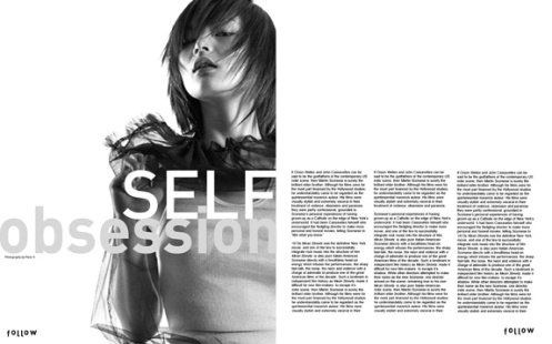
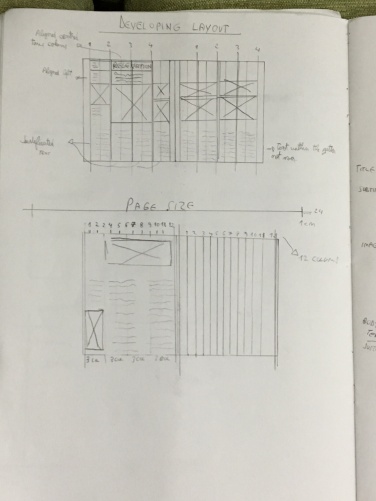
For this small brief, we’ve learned about different types of grids, such as single-column, multi-column grids, and also hang lines. Next, we have been put into pairs of two and been given a design magazine to deconstruct visually. We began deconstructing by sketching out the content and the grid from the chosen magazine. In order to deconstruct, I have tried to identify the grid system of the magazine, excluding the adverts. Our magazine page was formed of 12 columns.
It took me a little while before I found the grid system on the magazine page, this could sometimes be a bit tricky as some of the images are laying within 2 or more columns.
Next, I have been given a 6 column grid to create a poster layout by sketching out the content using different coloured markers.