
Magazine spread is two pages that are next to each other. Each spread works as one unit. It is not two pages separated but two pages that work together to create one unit. When designing magazines it is vital to look at these two pages as one single element even if those pages are going to contain two different stories. Even if one of the pages is containing an ad or even if one story is ending on the left page and another is starting on the right page (if possible you should avoid situations like these but sometimes they are unavoidable).
Readers see a spread as one unit. Since magazines are smaller than newspapers, magazine spread can be “digested” in one view because our peripheral vision encompasses the entire spread at normal viewing distance. On the other hand newspaper, especially large format broadsheet newspapers are scanned in several takes.
Because of this, you have to consider what will be on the other side of your spread. Will it be an ad, will it be the beginning of another story or maybe a full bleed image.

Elements of the spread:
Not all areas of the spread are equal. Some have more importance, some have less. For example, when you go to the newsstand, you pick up some magazine, you grab the magazine by the spine with your left hand, and with your right hand, you flip through the pages.
The most visible area at that point is the outer part of the right page. Another example is if you put the magazine on the table and start flipping the pages, the lighter (left part) of the magazine will be flipped and folded but the heavier (right part) will stay flat on the table, hence more exposed to the viewer’s eye. The process is reversed if someone is flipping magazine from the last page, then the outer left area of the page is the most visible one.
The most visible parts of a spread are outer upper parts
You should place your best content on the outside parts of the spread. These are the areas that are most seen. This is the place to put most provocative images and words. Put the best stuff where it will be most visible and where it will make the best impact. Most valuable areas of page spread are top left and top right parts because when you skim through the magazine these are the areas where you look the most. Make the most of them.
On the other hand, the bottom part of the spread, inner corners near the gutter are less important. Have you ever noticed how designers place footnotes and some credits in those parts of the spread? Now you know why.

Readers eye direction:
When influencing on the reader your design should have meaning. Readers concentrate on the top parts of the spread. This is the first place where their eye will stop when they skim through the pages so you cannot start your story by placing headline on the bottom right page. This is not a natural starting point.
I have seen this in so many examples, but try to avoid it. It is not good design if the reader has to search through the page to find the most important thing (if there is no image on the page), and that’s the headline. It is even worse if you put the headline at the bottom and you put the beginning of the story on top of it.
This is not a natural way of reading the story. Everything should have flow. You should work your way from the meaningful top left and then continue to the bottom. The headline, intro copy and then the main copy. That should be your guide.
This is the natural way of viewing things unless designer pulls his attention away by placing elements on the page that will attract the reader’s eye. Sometimes the headline can go on the bottom part of the page if this page has a full-page image that bleeds out of the page.

Image and body text arrangement:
When placing big blocks of text, try not to break them up. You should not throw elements on a page just for the sake of throwing them around. Let it have a meaning. A flow. If you put barriers on the page, reader will have a hard time following the flow of the story. Keep the flow of the text columns tidy and even.
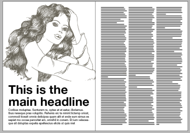
Things should be simple, and you should simplify the design by aligning the columns at the top and placing images above them. In this way, reader will have no problem to follow the text part of the story.

Take a look at these images above and you will see how the flow of the text is better in the second image. Red lines represent the direction of the eye. You will see how harder is to follow the text flow in the first image.
Ad pages:
Advertisers prefer right pages. Since advertisers want the great exposure that’s why they insist on being placed on the right page. Again, as you skim through the magazine you will notice their ad much easier. Especially if the ad is in vertical half a page format. Placing that ad in the inner part of the page, near the gutter, would be a great mistake. Costly mistake.
Always look at a spread as a unit
Left pages are great for editorial content. It is always good to know which ad will go on the opposing page. In this way, you can design editorial page in a way that will correspond with the ad. It is best to make a contrasting design on your editorial page. For example, if the ad is in blue shades, you should not use blue as central colour on your page. If the ad has emphasised image that bleeds out, you should design your page with more text and very few images. In this way, reader will have no problem to distinguish what is editorial and what is an ad. Of course, sometimes this is hard to carry out but try to make your editorial pages different from ad pages.
Try to remember these rules and follow them, once you are familiar with them you can start to break them, but only if it will bring something interesting and make the design better. Do not do something different just for the sake of making it different. Always have meaning for whatever you do.
This is a reblogged article used for research purposes, This article was written by Nikola from magazinedesigning.com
Sources:
http://www.magazinedesigning.com/magazine-spreads-good-bad-practices/
